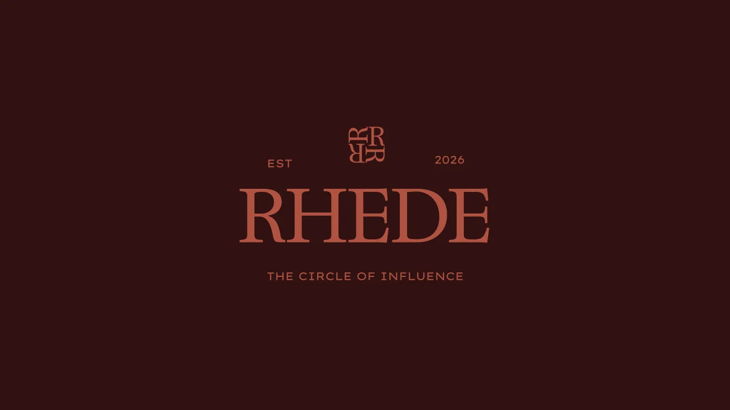
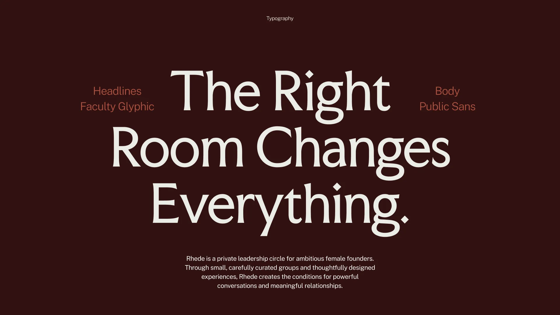
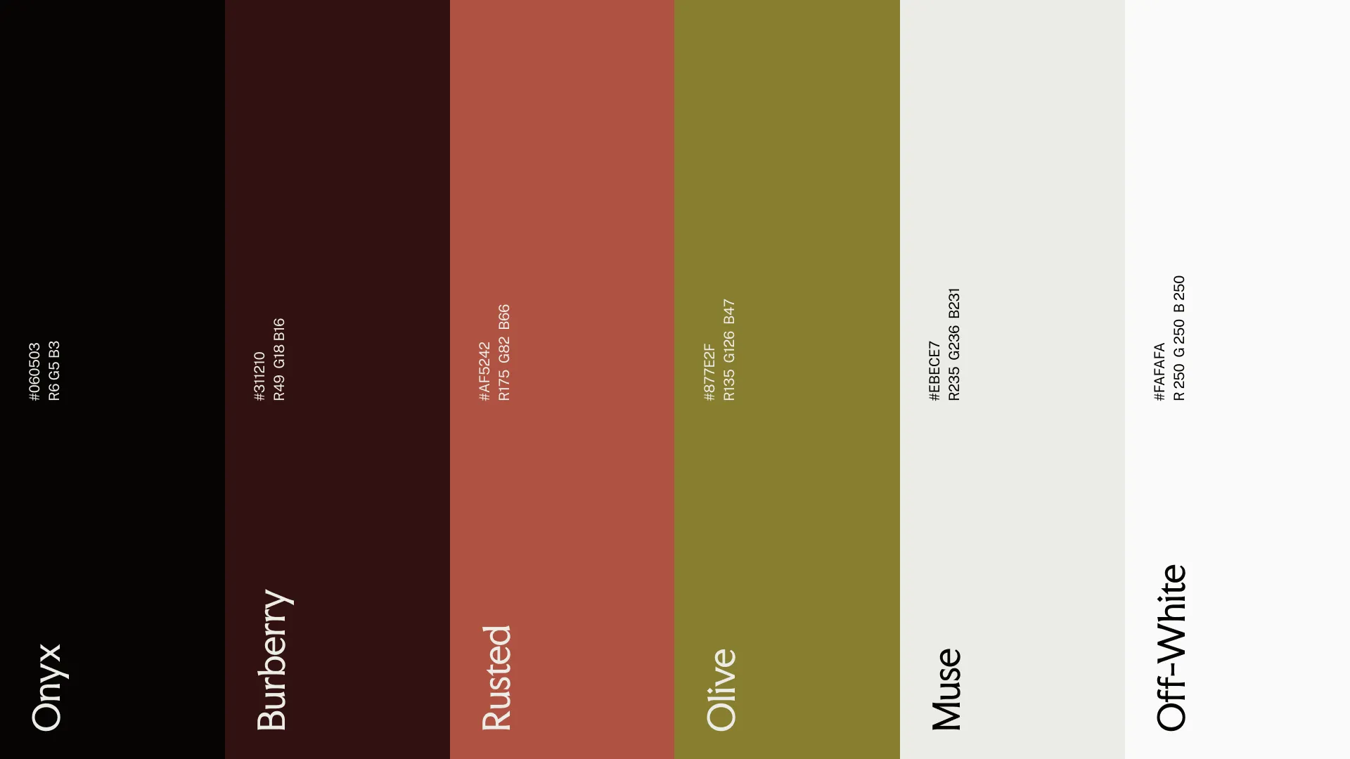
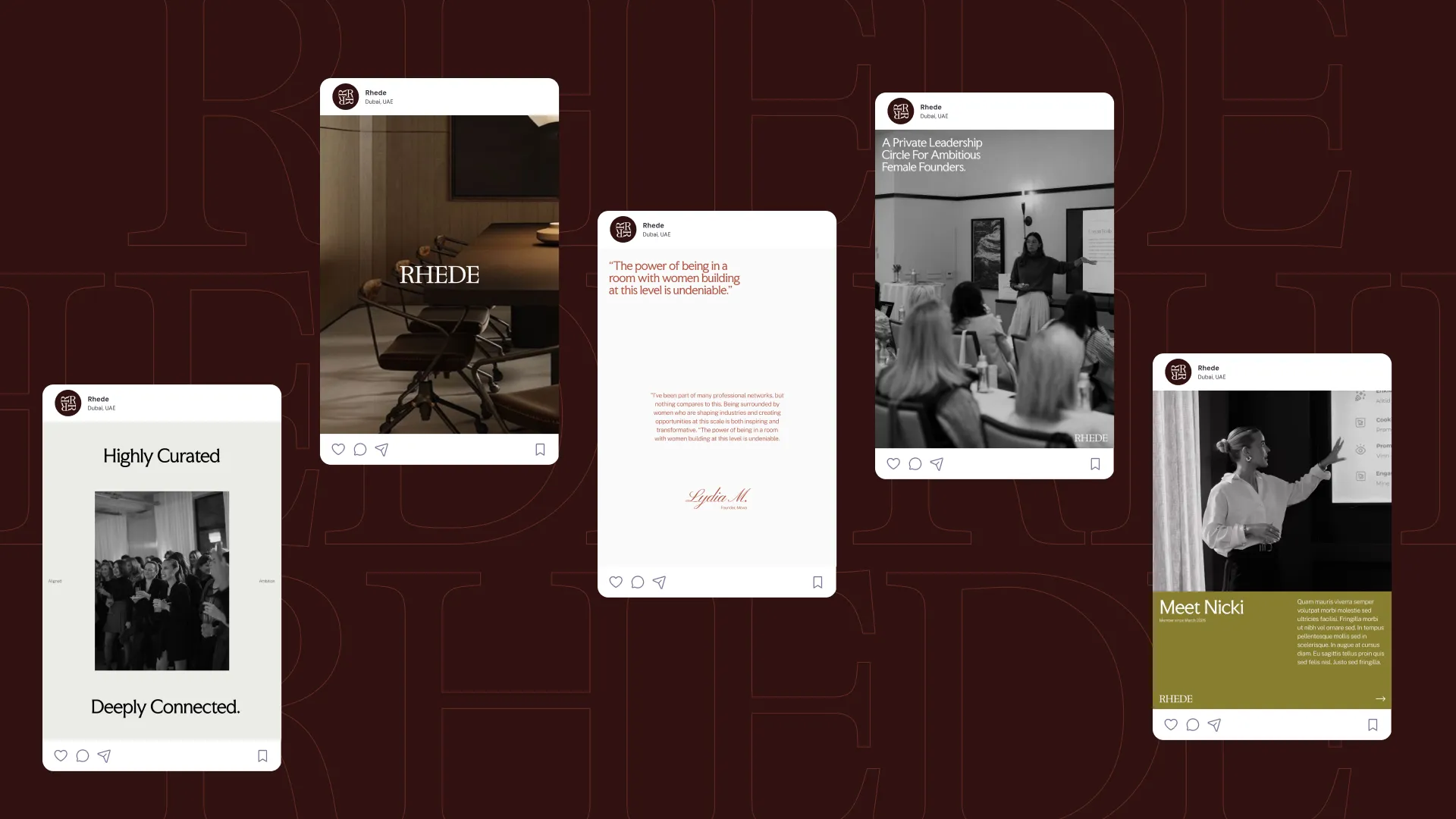
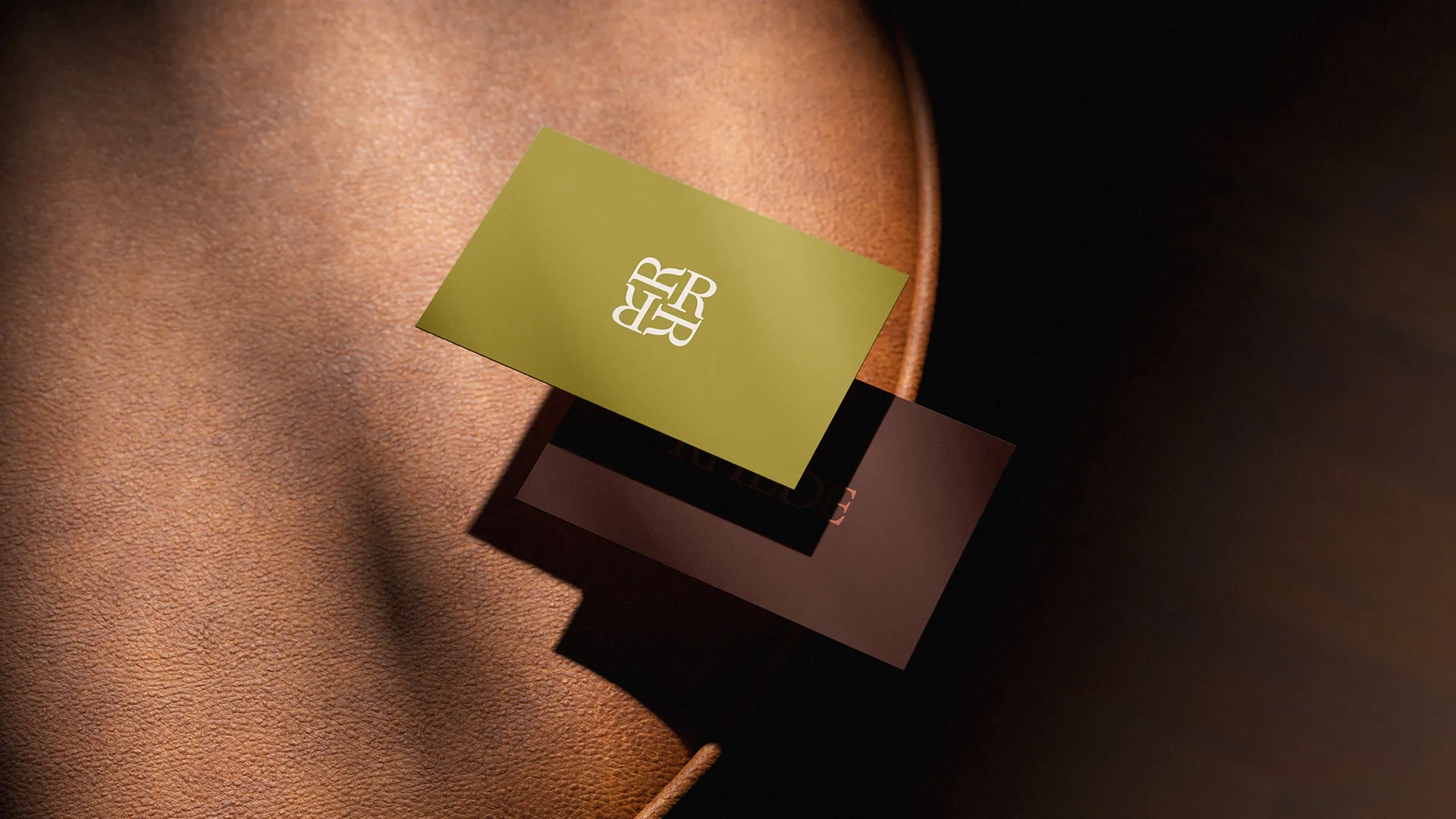
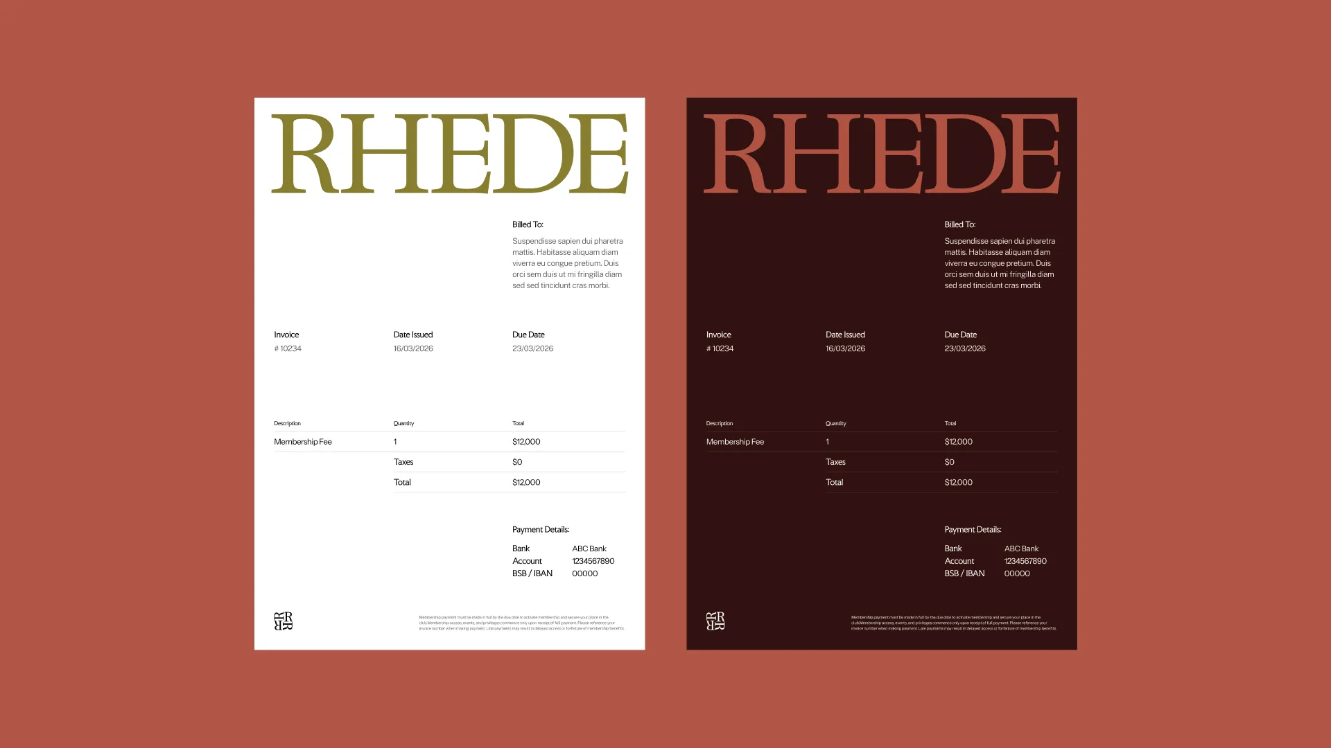
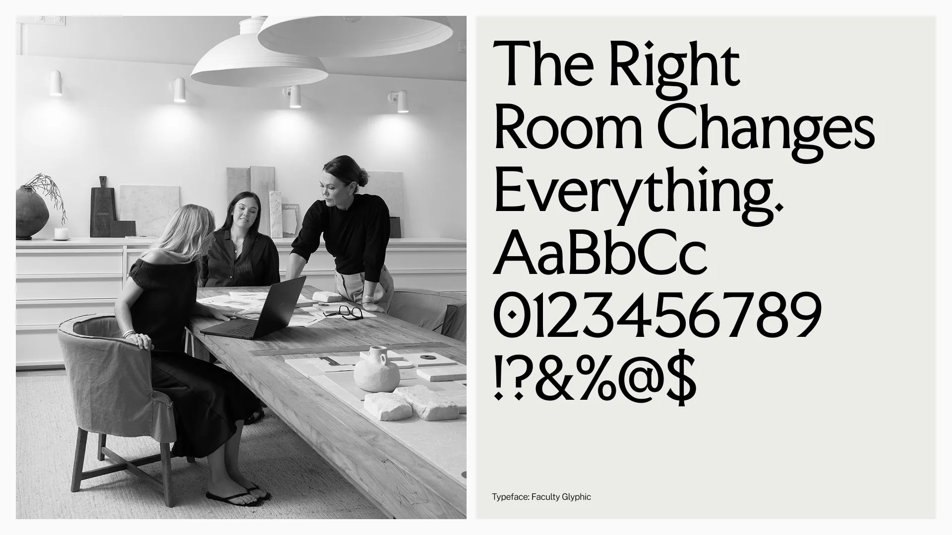
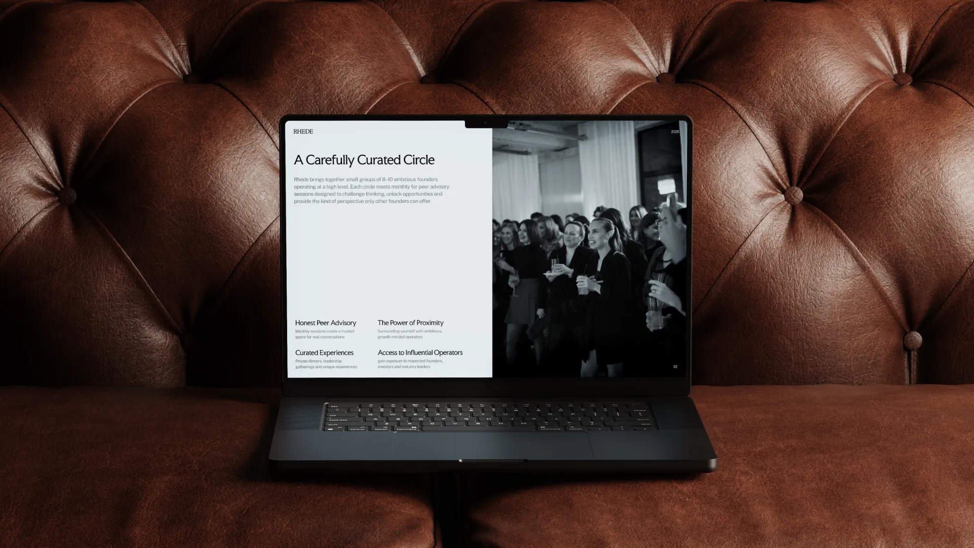
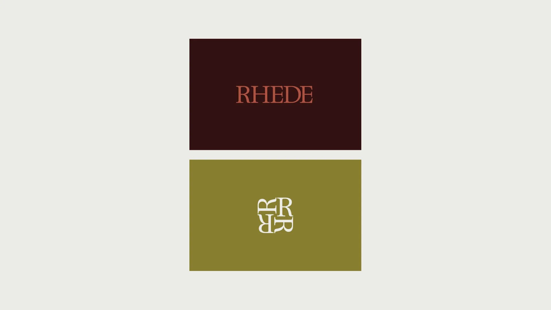
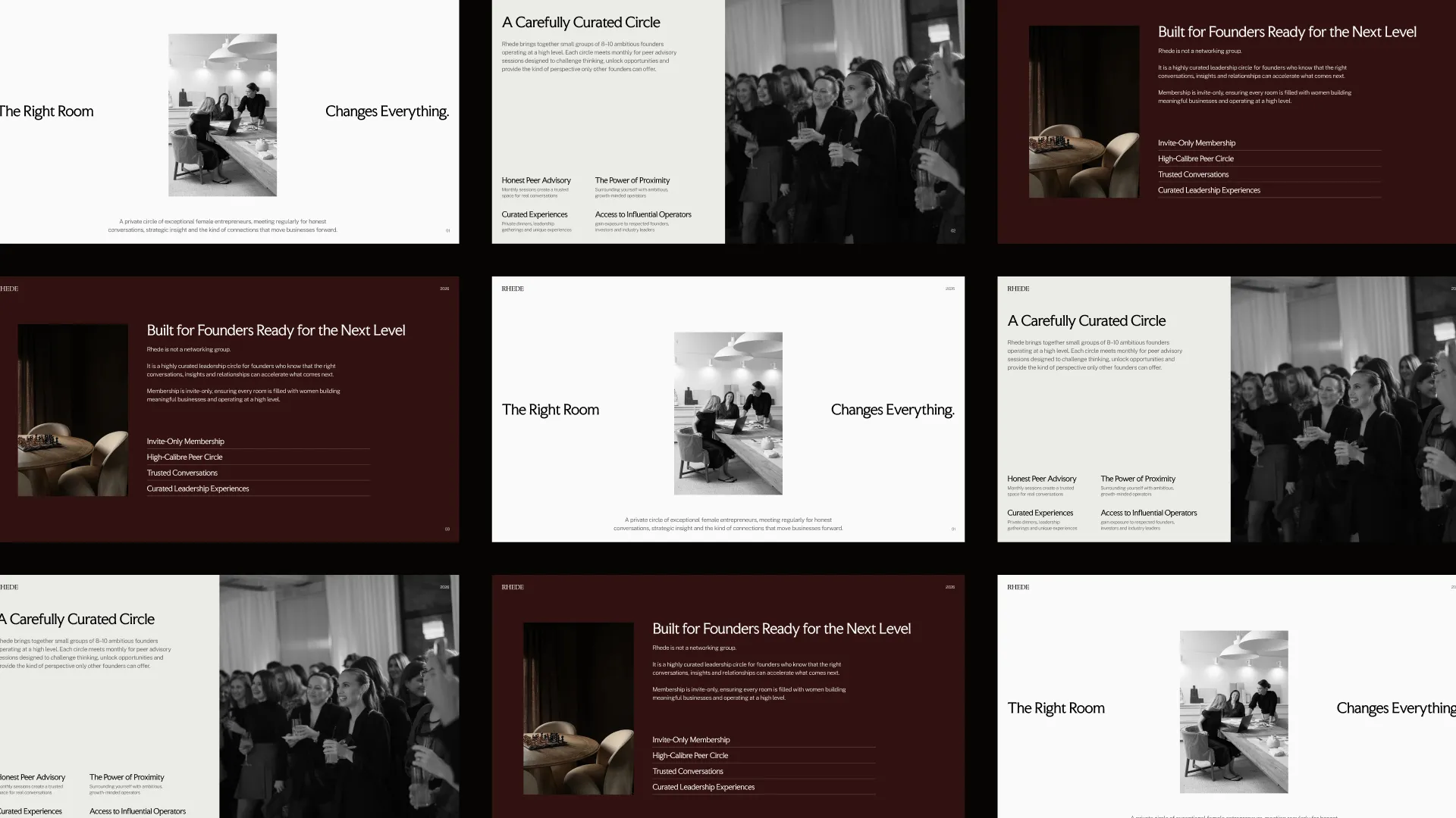
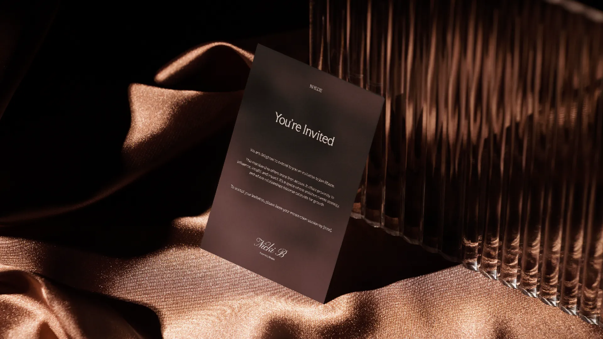
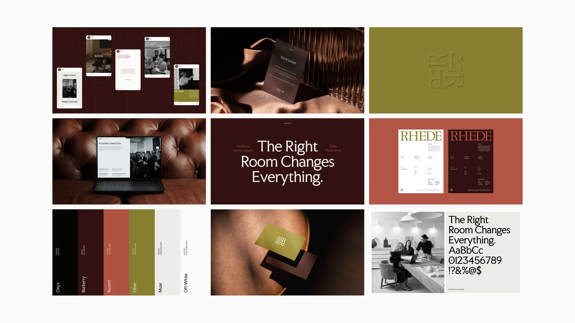
Through a focused brand sprint, we focused first on positioning Rhede as a space for women who are already in motion, not starting out, but building with clarity and intent. The strategy centred on removing the expected. Avoiding overly soft, overly polished, or performative “empowerment” aesthetics, and instead building something that felt grounded, refined, and quietly confident. Visually, the identity leans into restraint. A deeper, more considered colour palette creates a sense of focus and presence, while typography brings structure and clarity without feeling rigid. Every element was designed to feel intentional, from spacing and layout to the way the brand holds itself across touchpoints. The result is a system that doesn’t rely on being loud, but instead builds recognition through consistency, clarity, and subtle distinction.